Technique: Robert Vickrey on Acrylic

by Matthew Innis |


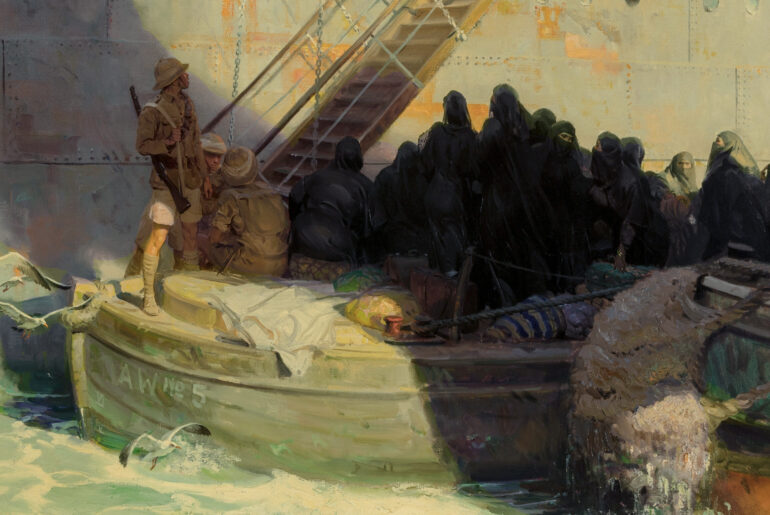
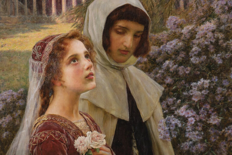
During a period when such movements as Minimalism, Op Art, and Abstract Impressionism ruled the art world, American Robert Vickrey (1926-2011) managed to find success and critical acclaim while pursuing the then less than popular genre of Representational Art.  His career spanned six decades, and in that time his paintings were included in no fewer than nine of the Whitney Museum’s annual exhibitions of contemporary art, were chosen to grace the cover of Time magazine more than 80 times, and were entered into the permanent collections of more than 80 public museums and institutions.  Among the many prestigious locations his work can still be seen include the Smithsonian Institute’s National Portrait Gallery, the Brooklyn Museum, the Metropolitan Museum of Art, and the Corcoran Gallery of Art.


A large part of Vickrey’s initial popularity was due to his subject matter.  Based on a personal symbology, Vickrey’s recurring motifs of bicycles, key rings, birds, butterflies, balloons, bubbles, shadows, and nuns (specifically the extravagantly cornetted Daughters of Charity), created scenes that were often surrealistic, and at times, abstract.  And perhaps surprisingly, it was the mystery of Vickrey’s “magic realism” that first garnered him praise even amongst critics who had long hoped representational art was dead (later works of Vickrey’s which featured more sentiment than eeriness, were not as well-received by critics, though they were still appreciated by the public).


What also brought attention to Vickrey was his choice of medium:  egg tempera.  He had learned how to work the the ancient medium while taking a required course as a student at Yale, and though the process was much-maligned by his peers, Vickrey soon saw its possibilities.  Developing his own methods, Vickrey found himself at the forefront of the mid-twentieth century, American tempera revival – a movement which included such other prominent artists as George Tooker, Paul Cadmus, and Andrew Wyeth.


Although egg tempera was Vickrey’s primary medium, it doesn’t mean it was his only medium.  Sometimes he ventured into other arenas, such as acrylics.  But unlike other artists who might turn to acrylic because of the rapidity at which it dries, Vickrey turned to acrylic when he wanted a medium that dried more slowly than egg tempera.  With the help of certain gels and retarders added to the acrylic, the opened working time allowed him to create works with a slightly different refinement than his usual works.


Below is a step-by-step example of Vickrey’s acrylic technique.  The colors he used were all made by Liquitex.  They included Cadmium Red Light, Cadmium Yellow Medium, Yellow Oxide (similar to yellow ochre), Cerulean, Cobalt, Burnt Sienna, Hooker’s Green (similar to viridian), Ivory Black, and Titanium White.  This color palette was much the same as his tempera palette (listed below with the artist’s comments), except for two colors (Yellow Oxide and Hooker’s Green).  Also the blues and the burnt sienna acrylics cover better than their tempera counterparts.


Vickrey’s Egg Tempera Palette
Cadmium Yellow Medium – A very strong color.  Great for warming up other colors.
Yellow Ochre – A very weak color.  Good for underpainting, washes, warming up skies.
Cadmium Red Light – A strong color necessary for flesh tones and, of course, red objects.
Cobalt Blue – A strong color for glazing, but it has no body.  A small amount of white, which kills its beauty, must be added to make it cover evenly.
Cerulean Blue – When mixed with cobalt blue it creates a rich blue which will still cover evenly.
Ultramarine Blue – A cold color.  I use it only to darken the darkest areas of my other blues.
Viridian Green – A fine but weak color.  It will not cover evenly unless mixed with a lighter color which may kill its subtle tones.
Burnt Sienna – I used to use Burnt Umber, but now I find this brown richer.  It makes fine neutral tones when mixed with Viridian Green and Yellow Ochre and glazed over gray.
Ivory Black – A strong pigment.  I only use it to darken other colors and to sign my name.
Titanium White – Fine for splattering and sponging.


Step 1.

Step 1.  For years I’ve studied the light that comes through the cheap glass windows of the room next to my studio. In late summer afternoons, the shadows of the tree leaves are distorted by the sun and broken up into semi-abstract patterns as they fall onto the floor and walls.  I wanted to see how this light would fall on one of my nuns. My daughter Carri posed in an improvised headdress, and the result was so fascinating that I have done several variations on this theme.

I started by nailing (along the edges) a piece of hot-pressed Whatman Board to a sheet of plywood.  This time I try a slightly different approach to the underpainting.  With bristle brushes and Liquitex acrylic, I broadly cover the surface of the paper with broken, almost cubistic, strokes of all the colors on my palette.  At this stage, I leave quite a bit of paper showing through the uneven patterns of arbitrary strokes and blocks of color.

Step 2.

Step 2.  The picture is moving ahead fast.  I hardly have time to photograph the next step before it begins to look very different.  I scrub in the cerulean blue over the underpainting to suggest the patterns of late-afternoon light coming through a window and falling on a blue wall.  Next, I load pure white into the slightly wet blue paint to suggest small whorls and point of light, an effect caused by the leaves of the trees outside and by the flaws in the windowglass.  I quickly sketch in a rough monochromatic head of my daughter Carri in a nun’s habit.  At this point the broken-colored underpainting still predominates the features, but the head is “coming out of the haze” faster than I expected.  Now I begin to work out the masses of light and shadow, similar to those I observe in the room next to my studio.

Step 3.

Step 3.  At this stage I concentrate almost entirely on the refracted light falling on the wall and the nun’s headdress.  Circular strokes of the brush indicate the spangles of light, which assume a diamond-like brilliance at this time of day.  I use old watercolor brushes with the points scissored off to a flat stubby edge since there’s no point in using new, perfectly pointed brushes for this donkey work.  The pyramidal shadow of the headdress makes its appearance at the right.

Step 4.

Step 4.  Using a crude mask of tracing paper and drafting tape, I cover the figure of the nun.  I place the painting flat on the floor and splatter a light patina of cerulean and cobalt blue liberally all over the wall area.  I show the mask half-peeled off to indicate what I’ve been up to.  The splattered texture doesn’t show up too well in the reproduction, but it is very clear in the original.

Step 5.

Step 5.  I start to glaze down and clarify the shadow areas of the face with my usual wash of a thin mixture of hooker’s green, burnt sienna, and yellow ochre (called yellow oxide by the Liquitex Company).  I paint the shoulders in very darkly, so that I’ll have my darkest dark to adjust my other tones to.  I knew I was going to introduce the motif of the trapped bird (with wings echoing the wings of the headdress), but I’m not sure where the bird (and its echo-like shadow) are to be placed, so I sketch these two elements onto separate pieces of transparent acetate.  I move these around until I get what seems to be the best arrangement of the shapes.  I also clarify the shadows and patterns on the wall, keeping in mind that they must be kept reasonably consistent with the patterns falling on the figure.

Step 6.

Step 6.  By scribbling on tracing paper with a soft pencil, I make crude carbon paper.  I place this under the pieces of acetate and trace the outlines of the bird and its shadow onto the painting.  I then fill in the silhouette of the bird with a dark-brownish neutral color and the bird’s shadow with a mixture of cobalt and cerulean, lightened with a touch of white.  I glaze some transparent pink over the nun’s face and generally clarify the features.

Step 7.
Robert Vickrey
Wings
acrylic
30 x 20 inches (76.2 x 51 cm)

Step 7.  Here is the completed painting.  I carefully mask off the figure once more and splatter a very light patina of cerulean blue over the whole background.  Finally, I glaze down the darkest shadows on the wall until they are almost as dark as the arms of the nun’s habit.  The lighted areas of the nun’s face are brought out with a light, opaque flesh tone composed of titanium white, cadmium red medium, cadmium yellow medium, and a touch of cerulean blue.  I refine the features with a small pointed watercolor brush.  The areas where the sunlight hits the bird are painted opaquely and then lightly glazed down with a warm tone.  I define the bird’s shadow areas with the neutral tone of the original silhouette, with a few details added.  The violently warped Whatman Board has now “settled down” and once again lies flat.


For more information on Vickrey’s tempera technique (and for more of his thoughts on acrylic), check out the artist’s two books written in the 1970s and now out of print:  New Techniques in Egg Tempera and Robert Vickrey:  Artist at Work.  I only have the latter, and it is a very enjoyable book.  In addition to the six demonstrations in the book, there is a selection of finished works, and a brief but humorous biography (Vickrey referred to himself later in life as an “affable curmudgeon,”  and here in these early writings you can see the funny ways by which his family and early experiences helped to shape him).  For a more in depth manual by a contemporary egg tempera artist, you might also consider Koo Schadler’s Egg Tempera Painting:  A Comprehensive Guide to Painting in Egg Tempera.

SaveSaveSaveSave

Leave a Comment

Recent Articles

Random Inspiration: An Jung-hwan Part II

by Matthew Innis |

Random Inspiration: An Jung-hwan Part I

by Matthew Innis |

An Exciting Week at Sotheby’s

by Matthew Innis |

Pierre Jean van der Ouderaa (1841-1915)

by Matthew Innis |